Projects
Haz click en un proyecto para verlo completo.

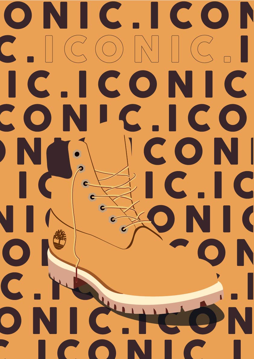
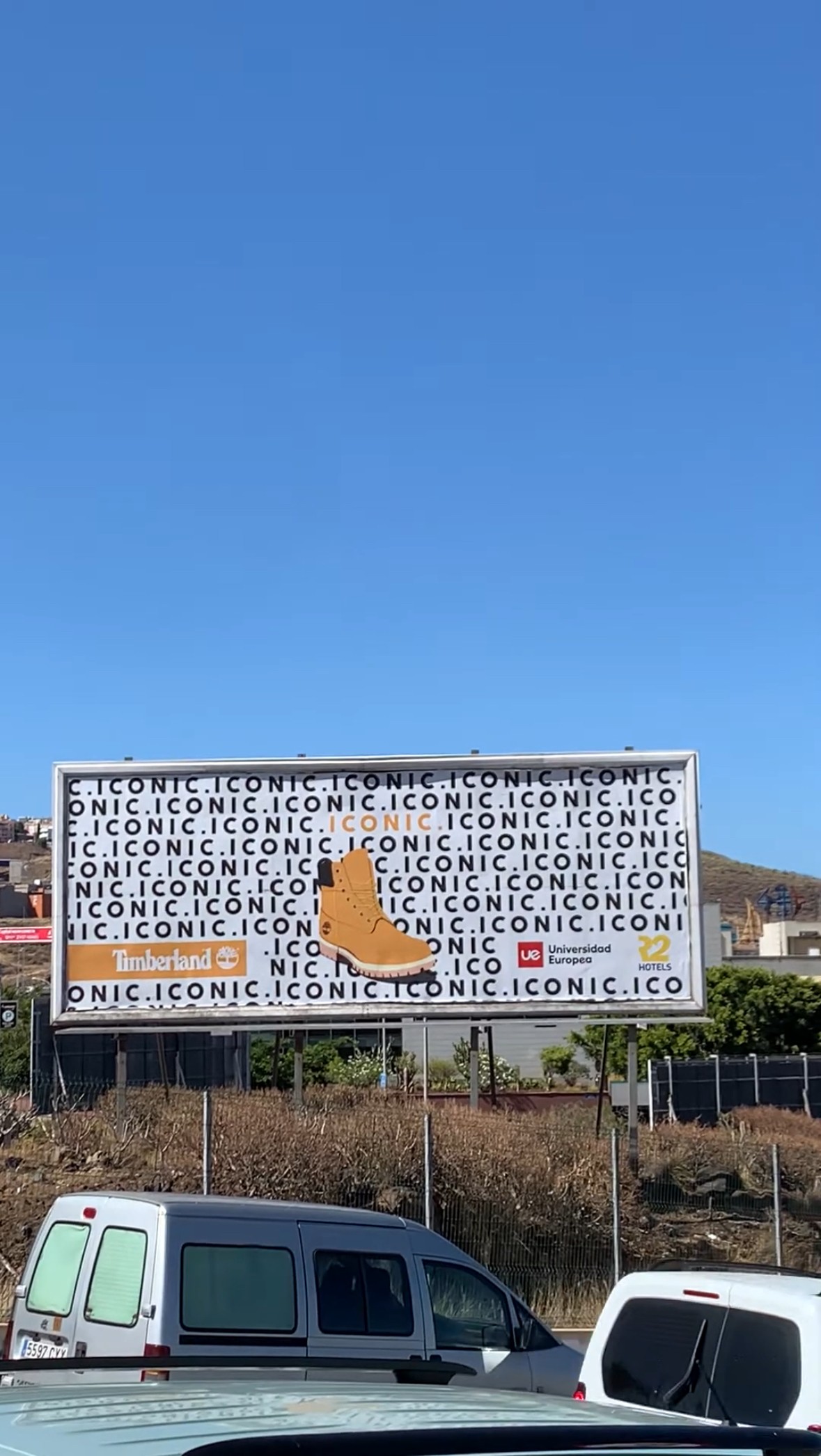
ICONIC
Timberland is an international brand that has been undergoing a major transformation in recent years, modernizing itself and targeting a younger audience. While staying true to its nature-inspired essence, the brand is now focusing on capturing the attention of younger generations and drawing them into its stores. This campaign was designed to engage and attract them, allowing them to fully immerse themselves in the culture and social movements that Timberland supports.
As part of this initiative, a competition was launched at the European University of the Canary Islands, open to all advertising students. I'm proud to say that I won first place, and my designs were displayed in all Timberland stores across the Canary Islands, including an 8m x 3m billboard.


Breaking into the Market with Humor and Authenticity
Bringing a multinational into the Canary Islands market is no easy task-especially in a saturated industry where standing out is a challenge. Our goal? Make a bold entrance using humor, relatability, and an irresistible price point.
With a multimillion-dollar investment at stake, we needed to ensure not just brand awareness, but profitability in the short term. The strategy was clear: reach our audience through the most cost-effective mass media, focusing on platforms that best aligned with our target demographic.


To achieve this, I worked across multiple creative disciplines, using graphic design, photography, and video editing with tools like Illustrator, Photoshop, and Adobe Premiere. The campaign covered a wide range of formats-from textile branding and roll-ups to in-store displays, large-scale billboards, and digital content.


Results That Speak for Themselves
The impact was immediate: over 50,000 sign-ups for the grand opening and a revenue of +EUR 1M just on launch day.
But beyond the numbers, what truly made this campaign special was the way we connected with people. We spoke their language-literally. Through humor, cultural references, and expressions that Canarians have grown up hearing, we made the brand feel familiar, friendly, and deeply local.


One of my favorite pieces? A 12m x 3m vinyl covering the side of the gym, placed directly across from the elevators and staircases. Instead of just branding, I saw an opportunity for a clever, culturally resonant joke.
People loved it. It became a viral moment, with many sharing it on their social media, reinforcing the sense of community and connection we had built through the campaign.
The best part? When the owner of the company assigned me this task, she simply said:
"THE GYM'S SIDE WALL NEEDS TO BE COVERED-DO WHATEVER YOU WANT."
So I did. And this was the result.
This project was a testament to the power of humor, cultural relevance, and creative storytelling in marketing. Because at the end of the day, a brand that can make you laugh is a brand you won't forget.

Some projects where the goal was to apply different photography techniques for various advertising purposes.
In this shot, a VOGUE cover aesthetic was recreated, playing with fabrics, lighting, and shadows in the studio. Elegance was key to create a setting that feels both passionate and sophisticated.
One part of this project was developed for the Mutua de Accidentes de Canarias (Canary Islands Accident Insurance Mutual). The objective was to create a message that promotes workplace safety and raise awareness.
The final poster was exhibited at "Sala MAC" during the summer of 2022.


Does this image look familiar? That's because it's a recreation of a famous piece of art. Do you know Banksy?
This photography is a reinterpretation of one of his most iconic graffiti artworks, adapted to create branding for a super urban brand.
Of course, I've also worked on product photography, and what better way to showcase a collection of items that work seamlessly together?


And let's not forget eCommerce product photography - a type of photography that may seem simple at first glance but hides plenty of secrets.
Don't believe me? Keep scrolling down to see the before and after shots.
They say a picture is worth a thousand words... but in this case, it's also worth about a thousand Photoshop layers. Check out the transformation!


Just as I am-both personally and professionally. The goal was to create a pure and natural image, one that truly reflects who I am. Honest and true to my principles. Don't ask me why, but I found the face more captivating without the eyes. And let's be honest... doesn't it draw you in even more this way?


Bringing Holiday Stories to Life-Silently
For IKEA's holiday campaign, the challenge was clear: tell a compelling story in just 20 and 10 seconds, without sound. The goal? Capture the warmth of the season and reinforce the idea that "Happiness is being with the ones you love."
With traditional media saturated during the holidays, we took a different approach-leveraging outdoor LED displays, a space where competitors rarely invest. This allowed IKEA to increase its presence in a fresh and unexpected way, reaching audiences in high-traffic locations.
The production process involved technical scripts, storyboards, professional video equipment, and post-production in Adobe Premiere, ensuring that every frame told the story visually, without relying on dialogue or sound. Through thoughtful cinematography, pacing, and color grading, we crafted a narrative that resonated deeply, even in silence.
The Impact
By stepping outside traditional holiday advertising channels, IKEA strengthened its emotional connection with its audience, reinforcing its message in places where it stood out from the competition. Sometimes, a story doesn't need words to be felt.

For this project, the challenge was to find a specific shade of aquamarine and incorporate it into different photography styles. The goal was to ensure that such a tricky color felt natural within its context while maintaining a cohesive aesthetic for its tone.
In this shot, artificial lighting was used in a studio setting.


Working with this color outdoors is incredibly more challenging, which is why I aimed for a slightly more apocalyptic aesthetic. Selecting the right locations was no easy task, but after exploring Tenerife, we found the perfect spots-giving the shot a subtle Roswell vibe.
 Rebranding
A Unified Vision: Rebranding for a Modern Optical & Hearing Center
This project involved the rebranding of an optical and hearing center that aimed to modernize its identity and expand its audience. The challenge? Create a cohesive logo that seamlessly represents both vision and hearing, while maintaining a modern and elegant brand image.

To achieve this, I utilized graphic design techniques, brainstorming sessions, and collaborative creative processes to develop a distinctive and sophisticated identity. The project encompassed:
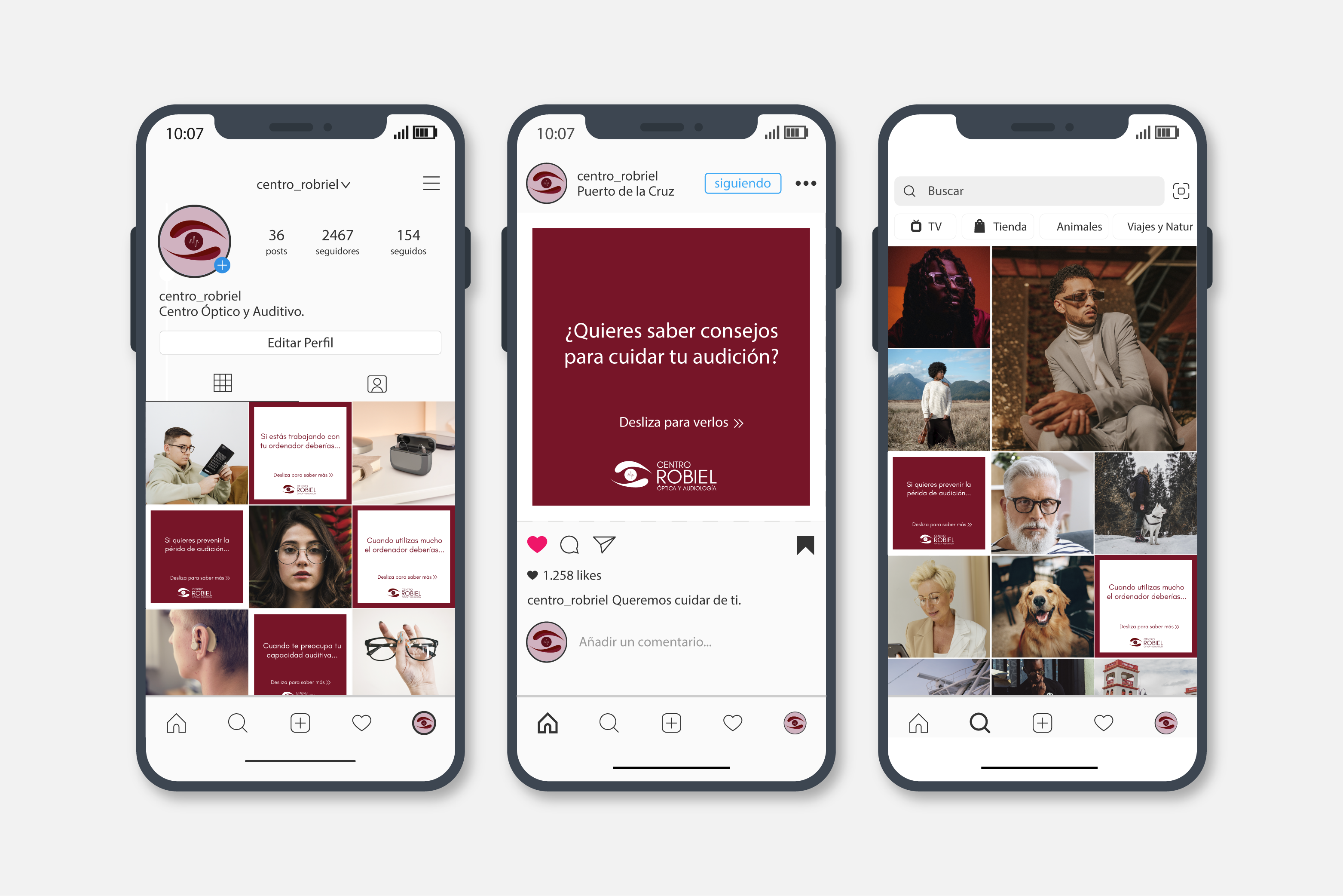
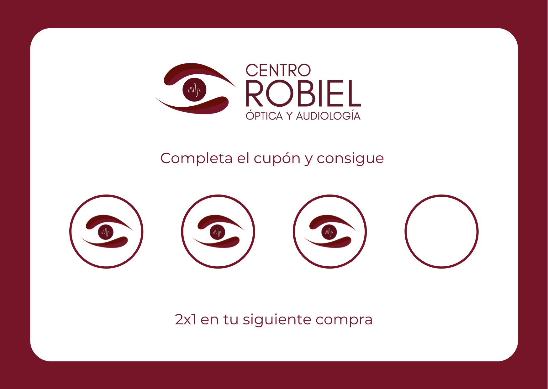
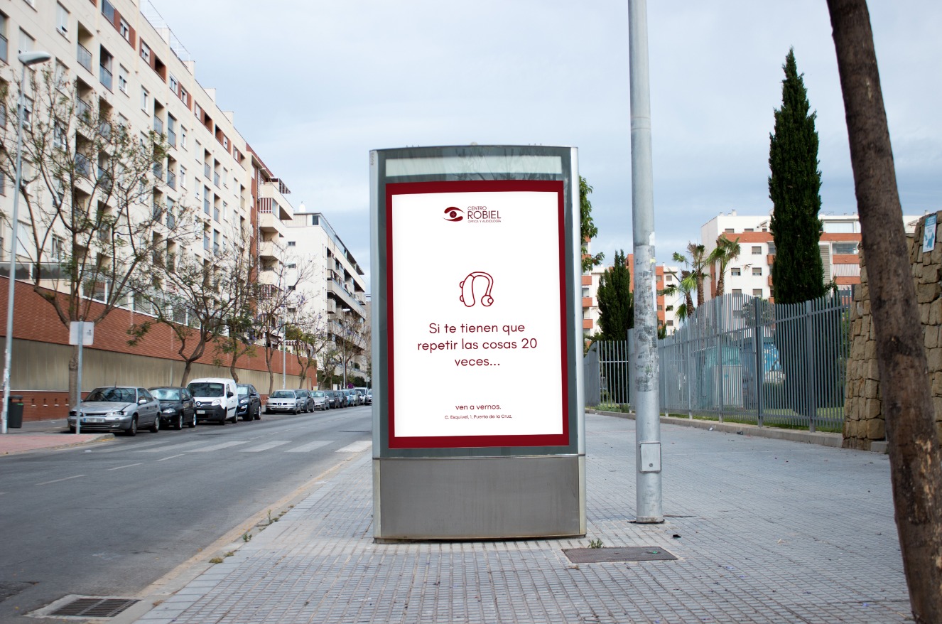
The Results
The center was highly satisfied with the new visual identity, and the rebranding had a measurable impact:
Gex!n – A Dynamic Identity for a Smarter Workflow

Gextiona, a tech company specializing in business solutions, needed a logo and brand identity for their new internal management app, Gex!n (ERP). The challenge? Create a modern, dynamic identity that connects with the company's branding while visually representing the app's efficiency and workflow improvements.
To achieve this, I used Adobe Illustrator, the golden ratio, subtle gradients, and negative space, crafting a sleek and innovative logo that reflects both structure and movement. The result is a visual identity that feels fresh, modern, and seamlessly aligned with the company's ethos.
The Outcome
The company loved the final design, embracing it as a symbol of innovation and efficiency. The logo not only represents Gex!n's purpose but also reinforces Gextiona's commitment to continuous improvement.


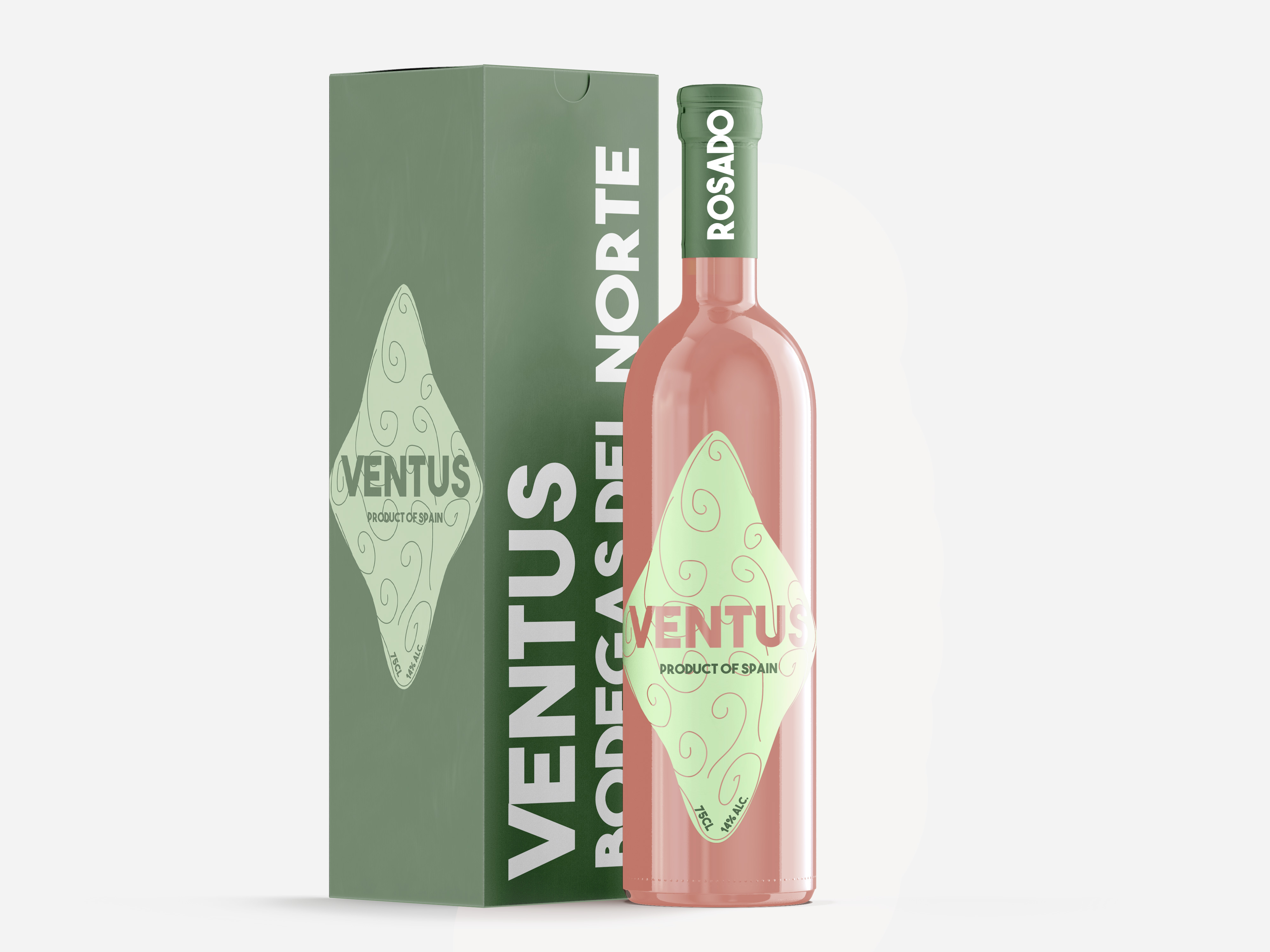
A Distinctive Identity for Canary Islands Wines
For this project, I was tasked with designing the packaging for a Canary Islands winery, with a clear objective: create a visually distinctive proposal that enhances the identity of each wine—without significantly increasing production costs.
The creative process involved brainstorming sessions, color palette explorations, and strategic use of negative space and color coding, all brought to life through Adobe Illustrator and Photoshop. The result? A packaging concept that not only stands out on the shelf but also perfectly embodies the essence of each wine:
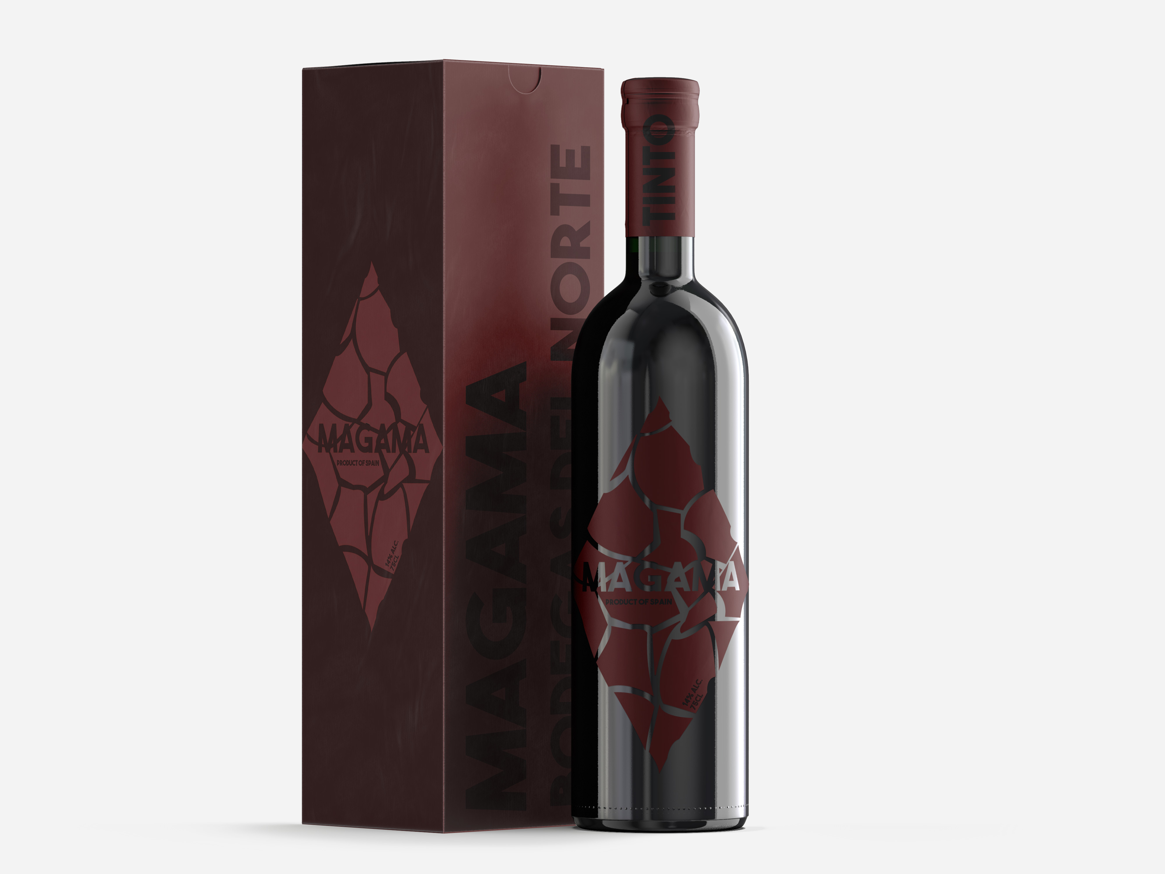
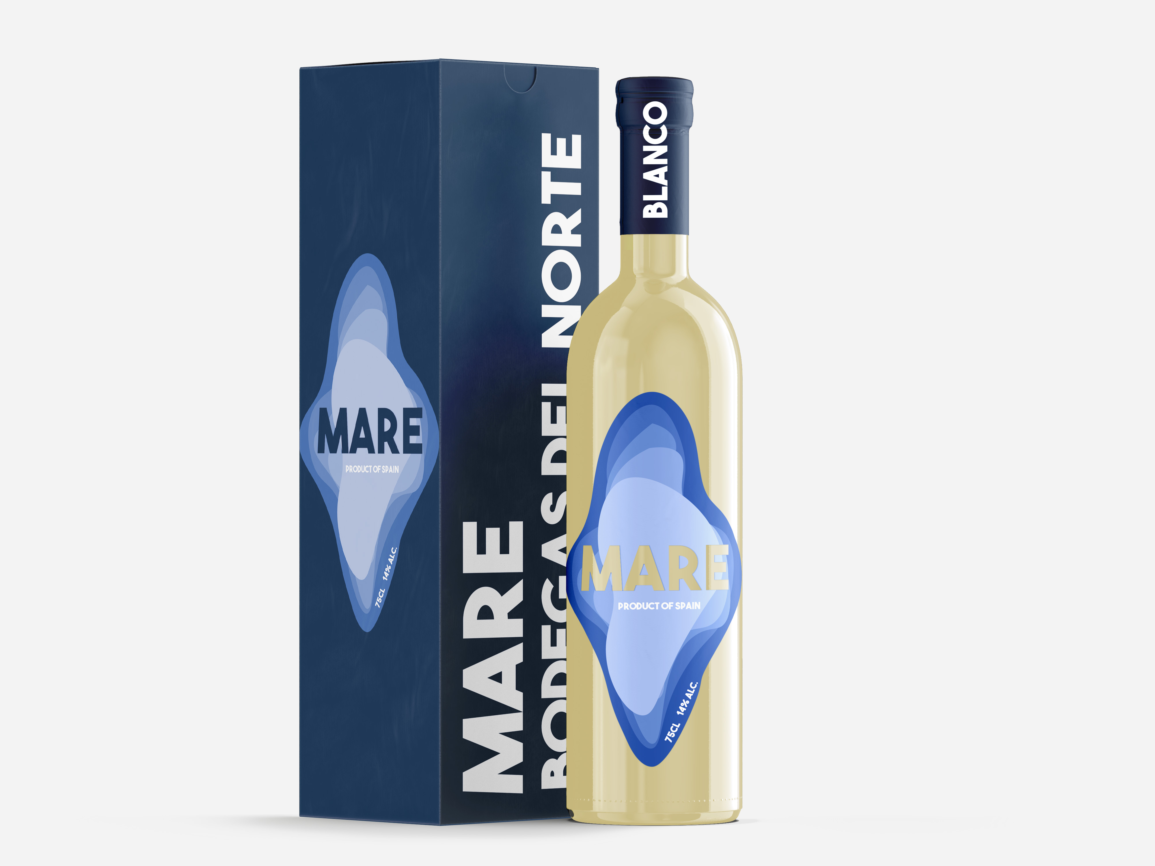
A Connection to the Island's Origins
A unique aspect of this project was the selection of the wine names, inspired by Latin words. By doing so, we traced back the origins of the Spanish language, creating a deeper connection to the land and its natural elements.
The Impact
The project was highly praised by both the company and consumers, successfully differentiating each wine while preserving the winery's identity.